
The Valencia Football Club logo is more than just a symbol — it represents the pride, history, and identity of one of Spain’s most iconic football clubs. Based in the city of Valencia, this club has a rich history dating back to 1919, and its logo has evolved over the decades to reflect both tradition and modern design. Fans worldwide instantly recognize the emblem as a sign of passion, excellence, and the spirit of Los Che.
In this article, we will explore the Valencia football club logo, its origins, symbolism, changes over time, and how it connects with fans and the club’s identity. Additionally, we will examine the broader context of branding in football, making this article a comprehensive guide for anyone interested in club logos and football culture.
The Origins of Valencia CF and Its Logo
Valencia CF, founded in 1919, quickly established itself as a leading club in Spanish football. From its earliest days, the club needed a symbol that represented both the city of Valencia and its footballing ambitions. The first iterations of the Valencia football club logo were simple but meaningful, incorporating elements inspired by the local region, its heritage, and traditional Spanish design motifs.
The original emblem served as a foundation for identity and recognition, ensuring that players, fans, and rivals alike associated the club with the values of Valencia: passion, resilience, and community pride.
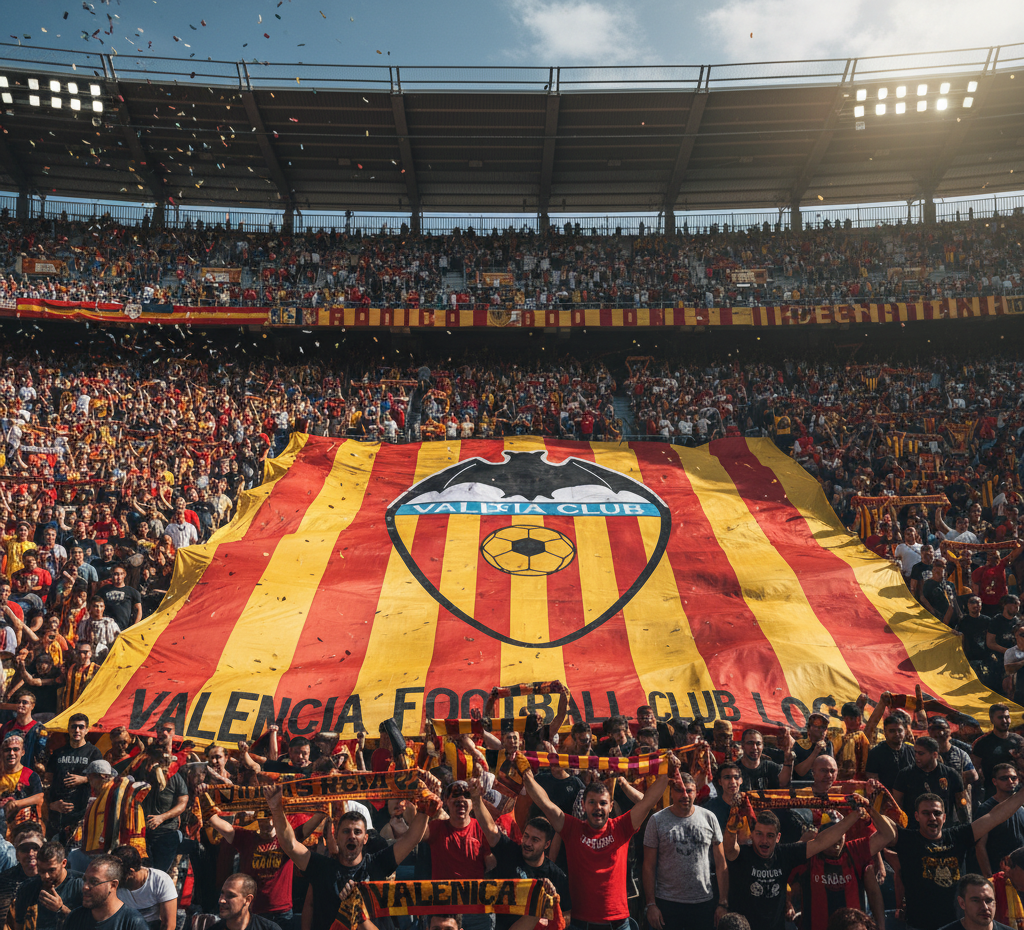
Symbolism Behind the Valencia Football Club Logo
The Valencia football club logo contains several elements, each with a distinct meaning:
The Bat:
One of the most recognizable aspects of the logo is the bat perched atop the shield. The bat is a historic symbol associated with the city of Valencia and represents protection, vigilance, and local heritage. Its presence in the logo links the club to its city and emphasizes loyalty to the region.The Shield:
The shield shape signifies strength, defense, and tradition. It is a classic element in football club logos, symbolizing the club’s resilience both on and off the field.Stripes and Colors:
The logo incorporates the colors of the Valencian flag — red and yellow stripes — reflecting local pride. Additionally, black and white accents in the logo often symbolize elegance, determination, and professionalism.The Football:
Positioned centrally, the football represents the club’s core purpose: playing the sport and achieving success on the pitch.
Each component of the Valencia football club logo is carefully chosen to convey meaning, combining local identity, sporting ambition, and timeless symbolism.
Evolution of the Valencia CF Logo
Over its century-long history, the Valencia football club logo has undergone several modifications. These changes reflect trends in design, modernization, and the club’s evolving image, while retaining its core symbolism.
Early Designs
In the first decades, the logo was relatively simple, often featuring the bat and a basic shield without intricate details. These early designs prioritized recognition and practicality over aesthetics.
Mid-Century Modernization
By the mid-20th century, the club introduced more detailed elements, including refined stripes, clearer outlines, and a more prominent football symbol. This period also saw subtle adjustments to the bat, making it more stylized and iconic.
Contemporary Logo
The current Valencia football club logo is sleek, modern, and highly recognizable. While respecting historical elements, designers have emphasized clean lines, sharper colors, and a balanced composition. The bat is now highly stylized, the stripes are bold and vivid, and the overall logo is suitable for digital media, merchandising, and global branding.
The Logo’s Role in Branding and Merchandising
A football club’s logo is more than just an emblem — it is the cornerstone of branding. The Valencia football club logo plays a critical role in:
Merchandise Sales: From jerseys to scarves, hats, and collectibles, the logo is instantly recognizable and appeals to fans worldwide.
Digital Presence: The logo is used on the club’s official website, social media platforms, and mobile applications.
Global Recognition: For international fans, the logo symbolizes Valencia CF, making it a key tool in expanding the club’s brand globally.
Marketing and Sponsorships: Sponsors often align themselves with the club’s logo, associating their brand with Valencia CF’s identity.
The success of Valencia CF’s merchandising and global brand relies heavily on the logo’s iconic status, demonstrating how visual identity contributes to football club growth.
The Emotional Connection with Fans
For supporters, the Valencia football club logo is a symbol of loyalty, passion, and belonging. Fans wear the logo proudly on jerseys, display it at their homes, and use it as a rallying point during matches. The bat and shield evoke a sense of history, while the colors remind fans of their regional pride.
Matchdays at Mestalla Stadium are filled with banners, flags, and scarves featuring the logo, turning it into a visual representation of collective enthusiasm and fan unity. The logo is more than an emblem — it is a source of identity and pride for generations of supporters.
Valencia CF Logo in Football Culture
In the broader football world, logos carry significance. The Valencia football club logo is often studied in discussions of football branding, heritage, and fan culture. Its combination of traditional symbolism with modern design has made it an example of how clubs can maintain identity while adapting to contemporary trends.
The logo also helps distinguish Valencia CF from other Spanish clubs, creating a clear visual identity that is easily recognizable both domestically and internationally.
Trivia and Fun Facts About the Logo
The bat atop the shield is unique among European football clubs and has become a symbol associated exclusively with Valencia CF.
The logo has inspired fan art, graffiti, and murals across the city of Valencia.
The combination of historic elements and modern styling makes the logo appealing for merchandise, from jerseys to limited-edition collectibles.
These details show that the Valencia football club logo is not only functional but also culturally significant.
How to Recognize the Valencia Football Club Logo
For fans new to Spanish football, recognizing the Valencia football club logo is easy if you know what to look for:
The bat perched atop a shield.
Red and yellow stripes inspired by the Valencian flag.
A stylized football in the center.
Black and white elements framing the emblem.
Spotting these features helps fans instantly identify Valencia CF among other football clubs, both on the field and in merchandising.
The Logo’s Future
The Valencia football club logo is expected to continue evolving subtly as the club modernizes its branding. However, any changes will likely retain the bat, shield, and iconic colors to respect history and fan sentiment. The balance between tradition and modernization ensures the logo remains relevant for decades to come.
Conclusion
The Valencia football club logo is a powerful symbol of history, pride, and identity. From its early origins to its contemporary design, it represents the spirit of the club and its fans. Every element, from the bat to the stripes, tells a story of heritage, passion, and dedication to football.
For supporters, the logo is more than an emblem — it is a badge of loyalty and a visual representation of Valencia CF’s identity. Whether on jerseys, banners, or digital platforms, the logo continues to connect the club with its fans and the wider football community, solidifying its status as one of the most iconic symbols in Spanish football.