
The Benfica Football Club logo is one of the most recognizable symbols in European football. Rich in tradition, deeply rooted in Portuguese culture, and filled with symbolic meaning, the emblem of Sport Lisboa e Benfica represents more than just a football team. It stands for history, unity, passion, and ambition.
For over a century, the Benfica badge has evolved while maintaining its core identity. From the majestic eagle perched at the top to the bold red and white shield below, every detail in the Benfica football club logo tells a story. In this comprehensive guide, we explore the origins, evolution, symbolism, and global impact of this legendary emblem.
Introduction to Benfica Football Club
Founded in 1904 in Lisbon, Sport Lisboa e Benfica is one of Portugal’s most successful and historic football clubs. Often referred to simply as Benfica, the club is part of Portugal’s “Big Three,” alongside FC Porto and Sporting CP. Over the decades, Benfica has built a reputation for domestic dominance and strong European performances.
The club’s identity is closely tied to its emblem. The Benfica football club logo has become a global symbol of Portuguese football excellence and one of the most respected badges in world sport.
The Origins of the Benfica Football Club Logo
The roots of the Benfica logo date back to the early 20th century. When the club was first formed, its emblem was simple, reflecting the modest beginnings of the organization. In 1908, after merging with another sports group, the club adopted additional symbolic elements that would define its identity for generations.
From that moment forward, the Benfica football club logo became more than just a badge. It transformed into a visual representation of the club’s mission, values, and multi-sport heritage.
Key Elements of the Benfica Football Club Logo
The Benfica logo is composed of several powerful elements. Each piece contributes to the badge’s meaning and visual strength.
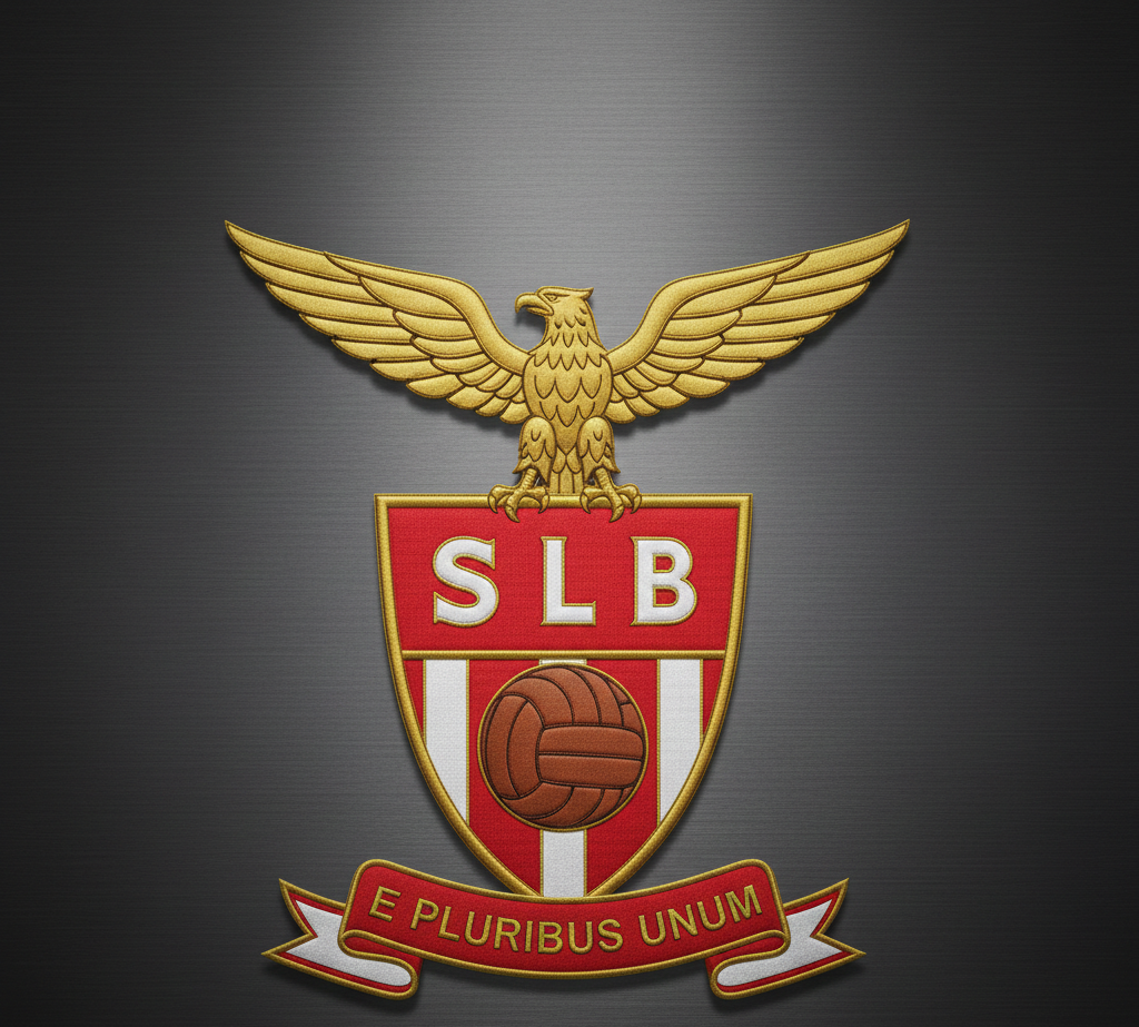
1. The Eagle – Symbol of Power and Vision
At the top of the Benfica football club logo sits a golden eagle. The eagle represents strength, courage, independence, and victory. It symbolizes the club’s ambition to soar above competitors and dominate the field.
The eagle is not only part of the logo but also a living tradition at the club’s stadium. Before home matches, a trained eagle flies across the pitch in a ceremonial display. This tradition reinforces the deep connection between the symbol and the club’s spirit.
The eagle’s wings spread wide across the crest, giving the logo a commanding presence that reflects Benfica’s powerful football legacy.
2. The Shield – Protection and Identity
Beneath the eagle is a shield, one of the most classic elements in football badge design. The shield represents protection, honor, and tradition. It reinforces the idea that the club defends its legacy and values with pride.
The shield design gives the Benfica football club logo a timeless and authoritative look, helping it stand out among modern minimalist logos.
3. The Red and White Colors
Color plays a major role in the strength of the Benfica emblem. The two dominant colors are red and white.
Red symbolizes passion, energy, bravery, and determination. It reflects the fiery spirit of Benfica players and supporters.
White represents unity, peace, and integrity. It highlights the club’s commitment to sportsmanship and solidarity.
Together, these colors create a bold and instantly recognizable identity. The red and white theme extends beyond the logo into jerseys, merchandise, and stadium decorations, strengthening brand consistency.
4. The SLB Initials
Inside the shield, the letters “SLB” stand for Sport Lisboa e Benfica. These initials are a central feature of the Benfica football club logo and reinforce the club’s identity.
The monogram design gives the logo a classic European football feel. Even without the full club name, fans around the world instantly recognize the SLB initials as a symbol of Benfica’s greatness.
5. The Football Symbol
At the center of the shield sits a football, representing the sport that brought the club global fame. While Benfica participates in multiple sports, football remains the heart of its identity.
The inclusion of the ball ensures that the logo clearly communicates its primary focus while maintaining its multi-sport heritage.
6. The Motto – “E Pluribus Unum”
Many versions of the Benfica football club logo include the Latin phrase “E Pluribus Unum,” meaning “Out of Many, One.”
This powerful motto reflects unity. It represents players, supporters, and members coming together as one community. Regardless of background, culture, or nationality, everyone connected to Benfica forms a single united force.
This message of unity is one of the reasons why the Benfica badge resonates so strongly with millions of fans worldwide.
Evolution of the Benfica Logo Over Time
Although the Benfica football club logo has maintained its core structure, it has undergone subtle refinements throughout its history.
Early versions were less detailed and more traditional. As graphic design evolved, the badge became sharper, more balanced, and visually optimized for modern media. However, unlike many clubs that have drastically simplified their crests, Benfica has preserved its classic elements.
This balance between tradition and modernization has allowed the logo to remain timeless while adapting to digital platforms, merchandise printing, and global branding needs.
The Cultural Importance of the Benfica Football Club Logo
In Portugal, Benfica is more than a football club — it is a symbol of national pride. The Benfica football club logo appears everywhere: on jerseys, flags, scarves, murals, and homes across the country.
For supporters, the badge represents:
Generations of football history
Legendary players and unforgettable victories
Family traditions passed down through decades
A deep emotional connection to Lisbon and Portuguese culture
Internationally, the logo has become a powerful sports brand. Benfica has millions of fans worldwide, making the emblem one of the most widely recognized football symbols in Europe.
Why the Benfica Logo Stands Out Globally
Many football clubs have redesigned their logos into simpler, modern crests. Benfica, however, has chosen to preserve its heritage. This decision gives the Benfica football club logo a rich and detailed appearance that distinguishes it from minimalist trends.
The combination of:
A majestic eagle
A traditional shield
Strong national colors
A meaningful motto
creates a badge that feels authentic and historic rather than corporate or generic.
This authenticity strengthens fan loyalty and maintains the club’s identity in an increasingly commercialized football world.
The Benfica Logo in Merchandise and Branding
The Benfica football club logo plays a crucial role in the club’s commercial success. It appears on:
Official match kits
Training apparel
Fan merchandise
Digital media
Sponsorship materials
Because of its strong visual identity, the logo adapts well across different formats. Whether embroidered on a jersey or displayed on a large stadium screen, the emblem maintains clarity and impact.
The badge has become a global symbol of Portuguese football excellence, helping Benfica expand its international presence.
Emotional Connection with Supporters
Perhaps the most important aspect of the Benfica football club logo is the emotional attachment it creates. For fans, the badge is not just a graphic — it represents passion, loyalty, and lifelong dedication.
Supporters proudly wear the crest over their hearts, chant for it in stadiums, and celebrate under its symbol. The logo becomes part of personal identity, linking individuals to a global community of Benfica supporters.
That emotional power is what truly elevates the Benfica emblem from a design to a legacy.
The Legacy of the Benfica Football Club Logo
After more than 100 years, the Benfica football club logo continues to represent one of Europe’s most respected football institutions. Its symbolism remains strong, its design remains powerful, and its message of unity remains relevant.
The eagle still soars.
The red still burns with passion.
The shield still stands firm.
The Benfica logo is not just a symbol of past success — it is a promise of future ambition.
Final Thoughts
The Benfica football club logo is a masterpiece of football symbolism. Every element — from the eagle to the shield, from the colors to the motto — tells a story of strength, unity, and pride.
In a sport where identity matters deeply, Benfica’s emblem stands as one of the most iconic in the world. It reflects history, inspires supporters, and carries the spirit of a club that has shaped Portuguese football for generations.
For fans and football enthusiasts alike, understanding the meaning behind the Benfica logo offers a deeper appreciation of the club’s heritage and enduring legacy.